 logo
logo


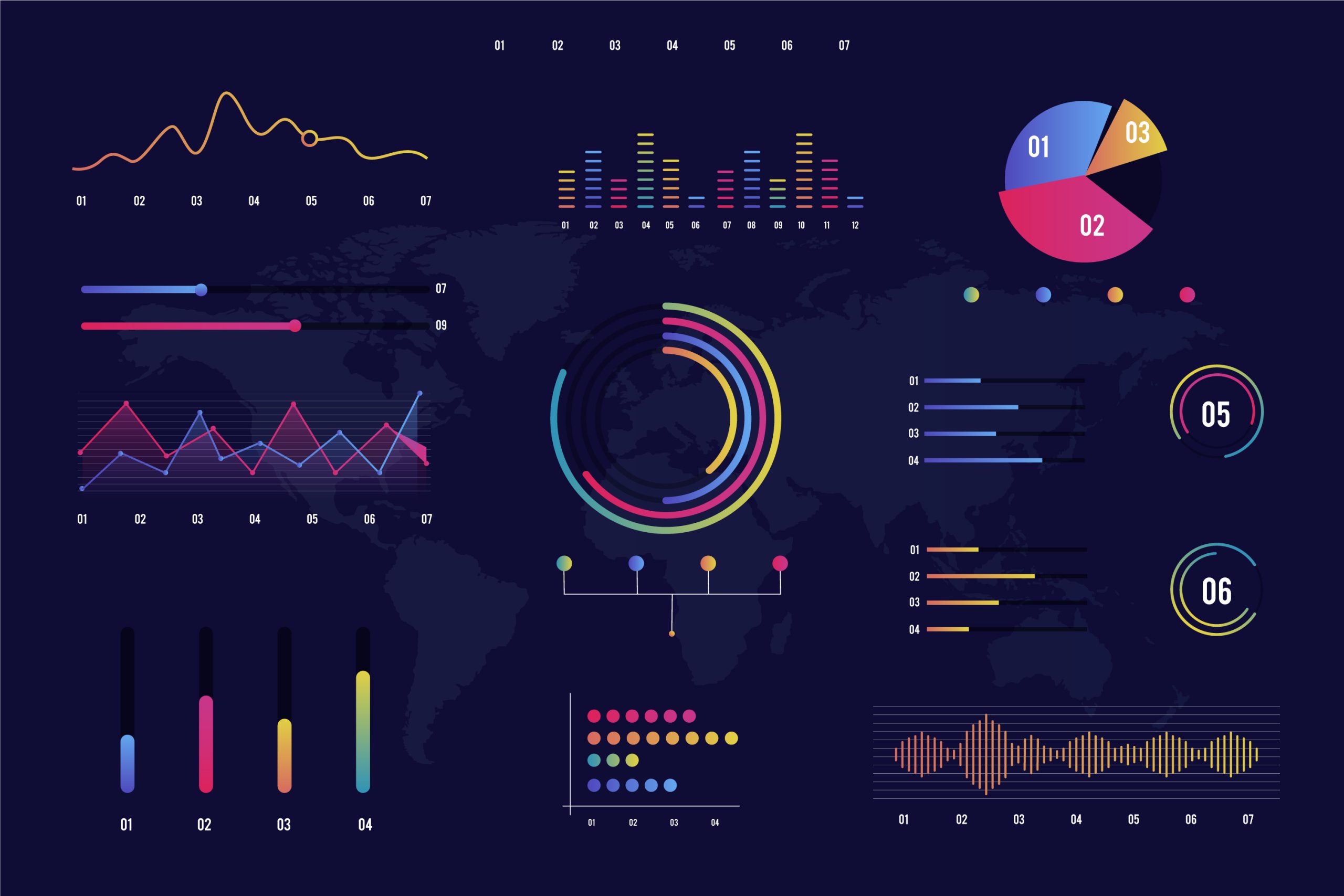
They say a picture is worth a thousand words but what about a collection of charts that can shape the fate of organizations and business activities? That is the essence of data visualization transforming numbers into meaning that can be seen and understood.
A single chart can reveal a performance deviation, uncover a growth opportunity, or signal a risk quietly emerging. With the introduction of artificial intelligence, visualization tools are evolving from simple visual displays into intelligent partners that suggest new perspectives, detect patterns, and highlight what truly deserves attention.
Let’s explore five AI-powered tools that help you visualize data in a way that genuinely supports decision-making.
First, what is data visualization?
In simple terms, data visualization is the process of converting raw numbers and information into visual representations that help the human mind quickly understand insights, relationships, and patterns.
Instead of working through long and complex tables, visualization makes it possible to see trends, comparisons, and anomalies through charts and graphs that emphasize what truly matters in the data.
Data visualization is a natural extension of analytical thinking. It enables analysts to ask sharper questions and direct attention to the signals that carry real meaning about performance or behavior.
Its importance becomes even more pronounced when the goal is decision support, not merely presentation or aesthetic output. A well-designed chart shortens the time needed to understand information, reduces the risk of misinterpretation, and communicates insights to decision-makers in a clear visual language.
As tools continue to evolve, visualization has become an interactive component of analysis—supporting hypothesis testing, scenario comparison, and linking results to real-world business context.
Today, many data visualization tools have leveraged advances in artificial intelligence to better support data analysts and simplify their work. In the next section, we’ll highlight some of the most notable ones.
The Most Important AI-Powered Data Visualization Tools
Tableau
Tableau is one of the most widely adopted data visualization tools within organizations, thanks to its strong ability to transform complex data into clear and intuitive visual dashboards. With the advancement of its AI-driven capabilities, the tool has evolved beyond traditional charting to actively support analysts in understanding data.
Its key features include:
- Automatic suggestions for the most suitable chart type based on the nature of the data
- Automated pattern and trend analysis through features such as Explain Data
- Faster visual exploration without the need for advanced design expertise
- Strong support for visual data storytelling when presenting insights to decision-makers
Microsoft Power BI
Power BI is widely used in enterprise environments, particularly due to its tight integration with the Microsoft ecosystem. Its strength lies in combining data visualization with intelligent analytics within a single platform that serves both business and analytics teams. Additional features include:
- Built-in AI capabilities for detecting patterns and anomalies
- Natural language querying that instantly generates visualizations
- Smart alerts for unexpected changes in key metrics
- Seamless linkage between visualizations and strategic KPIs
Google Looker
Google Looker focuses on connecting data visualization directly to the underlying data layer, ensuring that charts accurately reflect operational reality. AI further enhances this approach by supporting advanced interpretation and analysis. Key capabilities include:
- Visualizing data directly from the source without duplication
- Support for predictive analytics and understanding future trends
- Standardizing definitions and metrics across the organization
- Helping analysts build reliable dashboards suitable for long-term use
Qlik Sense
Qlik Sense relies on an intelligent associative engine that allows analysts to explore relationships in data without being constrained to a single analytical path. This approach provides greater freedom in exploring potential scenarios and contributes to:
- Automatic discovery of hidden relationships between variables
- Suggestions for alternative analytical paths during exploration
- Strong support for interactive, question-driven analysis
- Reduced bias resulting from viewing data from only one perspective
ThoughtSpot
ThoughtSpot stands out for its focus on AI-driven analytical search, enabling users to interact with data using natural language and instantly convert results into clear visualizations. This tool helps data analysts by:
- Allowing users to search data as if using a search engine
- Converting text-based queries into instant charts
- Accelerating access to insights without lengthy technical steps
- Empowering business teams to understand data while preserving analytical depth
This diversity in AI-powered data visualization tools naturally leads us to an important question:
- How do you choose the right tool for your analytical needs?
- On what basis does a data analyst choose the right data visualization tools?
This decision is guided by several key criteria, most importantly:
1. The objective of visualization
Choosing a visualization tool starts with the purpose, not with the visual template or aesthetic form. A chart is a means to convey a specific meaning that supports a specific decision. When the objective is unclear, visualization turns into a visually appealing display with little real impact.
Accordingly, the data analyst first defines the goal by:
- Identifying the type of decision: operational, marketing, financial, or strategic
- Clearly defining the audience: analysts, executive management, or operations teams
- Formulating one central question instead of multiple scattered messages
2. Nature and source of the data
The appropriate tool is more closely tied to the nature of the data than to the popularity of the tool itself.
Large, continuously updating datasets require tools that can handle performance and refresh efficiently, while smaller, static datasets may be well served by simpler solutions.
The choice also varies based on data type, whether it is structured data from databases, event-based data, or unstructured data such as text and reviews.
3. Governance and trust in metrics
The value of any dashboard increases in proportion to the trust placed in its numbers and trust starts with unified metric definitions and the ability to trace how they are calculated and accessed. This requires:
- Standardizing KPI definitions across the organization and avoiding duplicate standards
- Managing access permissions based on roles and data sensitivity
- Tracing data sources and calculation logic step by step
- Supporting auditing when needed to know how changes were made and by whom
4. Daily work requirements and team workflow
Including:
- Ease of learning versus depth of customization based on team needs
- Collaboration support: comments, reviews, versioning, and change management
- Secure and easy sharing internally and externally when required
- Fast performance in loading, filtering, and interaction
- Compatibility with different devices and embedding within daily work tools
5. Integration with the existing tool ecosystem
The more seamlessly a visualization tool integrates with data sources, preparation pipelines, and analytical environments, the less manual work is required and the more reliable and up-to-date the results become. In this context, analysts consider:
- Reliable connections to data warehouses and SQL databases
- Compatibility with existing ETL/ELT pipelines or data preparation tools
- Support for integration with Excel and Python/R when needed
- Automated alerts and distribution via email or communication tools
- Embedding within CRM/ERP systems or internal portals
In short, the right data visualization tool is not chosen for how impressive it looks, but for how effectively it serves the analytical goal, fits the data environment, and supports confident, well-governed decision-making.
A Final Word
No matter how intelligent data visualization tools become, they remain instruments that reflect the level of analytical awareness of the person using them. A chart may appear clear, yet still mislead if it is built on the wrong question; it may also reveal a genuine opportunity when placed within a sound methodological context. This is the practical truth: tools no matter how powerful—do not make decisions. The mind that directs them does.
From this perspective, the Data Analysis & Business Intelligence Diploma offered by the Institute of Management Professionals (IMP) stands out as a pathway that builds something deeper than mastery of a single tool.
It focuses on shaping an analytical mindset that understands data before visualizing it, connects visualization to the question, the question to the decision, and the decision to impact.
By combining solid theoretical foundations with hands-on application, the diploma prepares analysts to use any tool—whether traditional or AI-powered with confidence and rigor.
Develop your analytical skills to keep pace with the future one message is all it takes to learn more about the diploma and enroll.