 logo
logo


A data analyst treats charts as an analytical tool no less important than the data itself. They are the means through which raw numbers are transformed into a visual representation that helps uncover patterns and trends within data. While numerical tables may appear complex and difficult to read, the right chart can reveal in moments what might take a long time to discover through numbers alone.
For this reason, charts have become an essential part of the data analysis process across various sectors, whether for tracking sales performance, analyzing customer behavior, or evaluating operational efficiency within organizations. Good data visualization does not only aim to present data attractively, but also helps simplify complex information, highlight relationships between variables, and enable decision-makers to understand data quickly and make more accurate decisions.
With the wide variety of chart types and their different uses, a data analyst needs to know when to use each type, so that the chart reflects the nature of the data and the analytical message they want to convey.
In this article, we will review the most common types of charts and their uses, clarifying the situations in which each type is the most suitable choice for describing and presenting data clearly and effectively.
Before listing the different types of charts, let us first look at the impact that simply choosing the right chart can have on data visualization.
How Does Choosing the Right Chart Help Improve Decisions?
The role of charts is not limited to making data presentations more attractive or reports more visually appealing. Choosing the right chart is a fundamental step in transforming data into insights that can be relied upon for decision-making. When data is presented clearly and in an organized manner, it becomes easier for managers and decision-makers to understand trends and patterns without having to analyze long tables of numbers.
Proper data visualization also helps reduce the time needed to understand information, as a manager or executive can identify an important trend or potential issue within seconds through a clear chart. On the other hand, using an unsuitable chart may hide certain patterns or give an inaccurate impression of the data, which can lead to decisions not based on a correct understanding of reality.
Well-chosen charts also contribute to improving communication within organizations, as they help different teams such as marketing, operations, and management understand data easily even without an advanced technical background. When data becomes understandable to everyone, it transforms from mere information stored in systems into an effective tool that supports strategic planning and guides operational decisions within the organization.
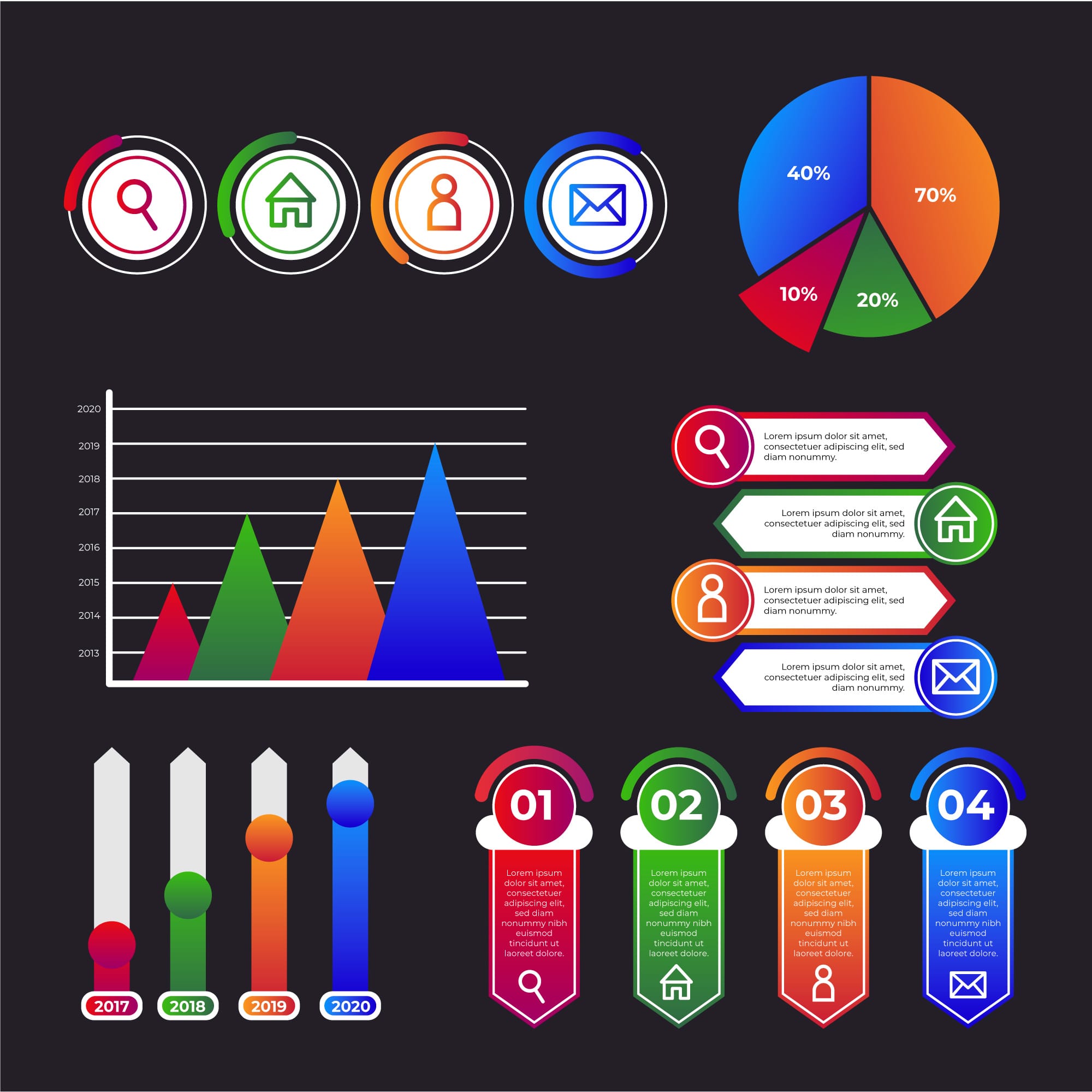
The Most Notable Types of Charts and Their Key Uses
Charts vary to include the following:
Bar Chart: The bar chart is one of the most widely used charts in data analysis, and is primarily used to compare values across different categories. It represents each category with a bar that shows its value, making it easy to notice differences between categories. This type of chart is known for its clarity and ease of reading, which is why it is commonly used in management reports and dashboards that aim to present comparisons directly.
Key uses:
- Comparing values across different categories, such as comparing sales between products or geographic regions.
- Analyzing departmental performance within an organization, such as comparing sales team results.
- Presenting survey results by comparing the number of responses for each option.
- Illustrating the ranking of categories by value, such as displaying best-selling products.
Line Chart: The line chart is primarily used to display change in data over time, where values are represented by points connected by a line that shows the general trend of the data over a given period. This type of chart helps identify long-term trends or seasonal changes within data, which is why it is widely used in sales analysis, economic data, and company performance tracking over time.
Key uses:
- Analyzing change in data over time, such as tracking monthly or annual sales.
- Identifying general trends in data, such as user growth over the years.
- Comparing the development of multiple variables over time, such as comparing the performance of several products.
- Analyzing seasonal patterns, such as changes in demand across different seasons.
Pie Chart: The pie chart is used to display the percentages that represent the components of a single dataset, where the circle is divided into segments reflecting each category’s share of the total. This type is suitable when the goal is to show how the total value is distributed among a limited number of categories, provided the number of categories is not too large so that the chart remains clear and easy to read.
Key uses:
- Displaying the percentage distribution within a dataset, such as market share distribution.
- Clarifying each category’s contribution to the total value, such as product contributions to overall sales.
- Analyzing customer distribution by segment, such as age groups or regions.
- Presenting budget or cost components, such as expense distribution within an organization.
Scatter Plot: The scatter plot is used to analyze the relationship between two variables, where each point on the chart represents the values of both variables together. This chart helps discover relationships or patterns between variables, such as the relationship between marketing spending and sales. It can also be used to identify outliers or unexpected patterns within the data.
Key uses:
- Analyzing the relationship between two variables, such as the relationship between price and demand.
- Discovering patterns or clusters within data, such as the behavior of different customer groups.
- Identifying outliers that differ from the rest of the data.
- Analyzing the effect of one factor on another variable, such as the impact of marketing campaigns on sales.
Histogram: The histogram is used to display the distribution of numerical data within defined ranges. It resembles a bar chart in appearance but differs in that it displays the distribution of values within a continuous dataset rather than comparing categories. This chart helps understand how data is spread and whether it follows a normal distribution or contains skewness.
Key uses:
- Analyzing the distribution of numerical data, such as the age distribution of customers.
- Understanding the spread of values within a dataset, such as salary distribution within an organization.
- Identifying anomalies in data, such as unusually high or low values.
- Evaluating the shape of data distribution, such as determining whether it is normal or skewed.
Stacked Chart: The stacked chart is used when the goal is to display the total value while clarifying its different components. Each bar or area is divided into segments representing each category’s contribution to the total. This type of chart helps understand how the overall value is composed of multiple elements.
Key uses:
- Displaying the components of a total value, such as sales distribution across products.
- Analyzing each element’s contribution to the overall total, such as regional contributions to total revenue.
- Tracking changes in data components over time, such as shifts in revenue sources.
- Understanding the distribution structure within data, such as cost distribution across different departments.
What Role Does the Analyst’s Mindset and Skills Play in Choosing the Right Chart?
Choosing the right chart does not depend solely on the tool, but on how the analyst thinks and understands the data. A data analyst can use the following checklist to help select the most suitable visualization:
Define the goal of the analysis: Ask yourself first: what message do I want to convey? Is the goal to compare values, show a trend over time, or analyze the relationship between two variables? The answer to this question will usually determine the appropriate chart type.
Understand the type of data being analyzed: Is the data categorical, time-series, or continuous numerical? For example, time-series data suits a line chart, while comparisons between categories suit a bar chart.
Determine the number of variables in the data: Some charts display only one variable, while others such as scatter plots can show the relationship between two or more variables.
Consider the clarity and readability of the chart: The purpose of a chart is to simplify data, not complicate it. Choose a chart that the reader can understand quickly without needing a lengthy explanation.
Consider the target audience of the analysis: The audience may be managers or non-technical teams, so choose a simple and clear chart that helps them understand the data easily.
Avoid charts that may lead to misleading interpretation of data: Such as using a pie chart for a large number of categories or choosing an inappropriate axis scale that may exaggerate differences between values.
Connect the chart to the analytical story of the data: The chart should be part of a clear narrative that begins with the problem and ends with an insight that supports decision-making.
What Role Does the IMP Diploma Play in Preparing You for Data Visualization?
Know that mastering data visualization is not limited to knowing the different chart types. It requires a deeper understanding of data and how to analyze it and connect it to a business context. This is where the Data Analysis & Business Intelligence Diploma from the Institute of Management Professionals (IMP) comes in, offering trainees an integrated training path that helps them develop their skills in analyzing and visually presenting data in a professional manner that supports decision-making.
The role of the diploma in preparing trainees for data visualization can be summarized in the following points:
- Building a strong foundation in data literacy, including data types, sources, and structure, which helps trainees choose the most suitable method for visual presentation.
- Developing data analysis skills using Excel, including advanced formulas and PivotTables to analyze data and extract indicators that can later be converted into clear charts.
- Preparing and cleaning data using Power Query to organize and connect data from multiple sources before using it to build charts and dashboards.
- Learning dashboard design using Power BI to create professional visualizations and interactive dashboards that enable quick data comprehension.
- Understanding data modeling to organize data in a way that makes it easier to analyze and present clearly within charts.
- Developing data storytelling skills to help decision-makers understand data and take appropriate action.
Through this training program, trainees become capable of moving beyond simply presenting numbers to designing professional data visualizations that help organizations understand their data and make confident, data-driven decisions.
Contact the IMP team to learn all the details and join the diploma.